ROLE
LEAD UX DESIGN + DESIGN SYSTEM
YEAR
2023
DESIGNTEAM
2 Designers
TIMELINE
3 - 4 MONTHS
City Of Bruges Website
about.
Context
The city of Bruges wanted to build the best city website in Belgium. Not just a visual refresh. A complete rethink of how citizens find what they need. City websites are messy by nature. Hundreds of services, multiple departments, regulations, appointments, events. Everything has a place but not everything deserves equal weight. The goal was simple to say: make any piece of information reachable within four clicks, for any type of citizen.
My role
Lead designer on the project, working in a team of two. I facilitated workshops with city stakeholders to align on ambition and priorities. Then I took ownership of the architecture, the homepage, the key page templates and making sure citizen logic stayed at the centre throughout.
Structuring the new information architecture
Designing the homepage and primary flows
Defining key page templates
Guarding the citizen-first logic throughout
My focus was always on structure first. Clarity before styling. The homepage went through a lot of visual directions before we landed. That exploration was necessary — the visual language had to earn the trust of a public institution while still feeling modern and accessible.


challenge
The existing website followed internal logic. Departments and administrative structures were the navigation. Citizens don't think that way. They think in tasks.
The challenge:
Translating complex city services into understandable journeys
Connecting online and offline services
Getting rid of inside-out thinking in navigation
Making it accessible and inclusive for everyone
Simplifying didn't mean cutting content. It meant organising it around how people actually search and decide.


how did i get there
The result
We rebuilt the information architecture from scratch around task-oriented navigation.
Clear entry points based on intent, not department
Consistent page templates across all services
Modular components for scalable content management
All information within four clicks
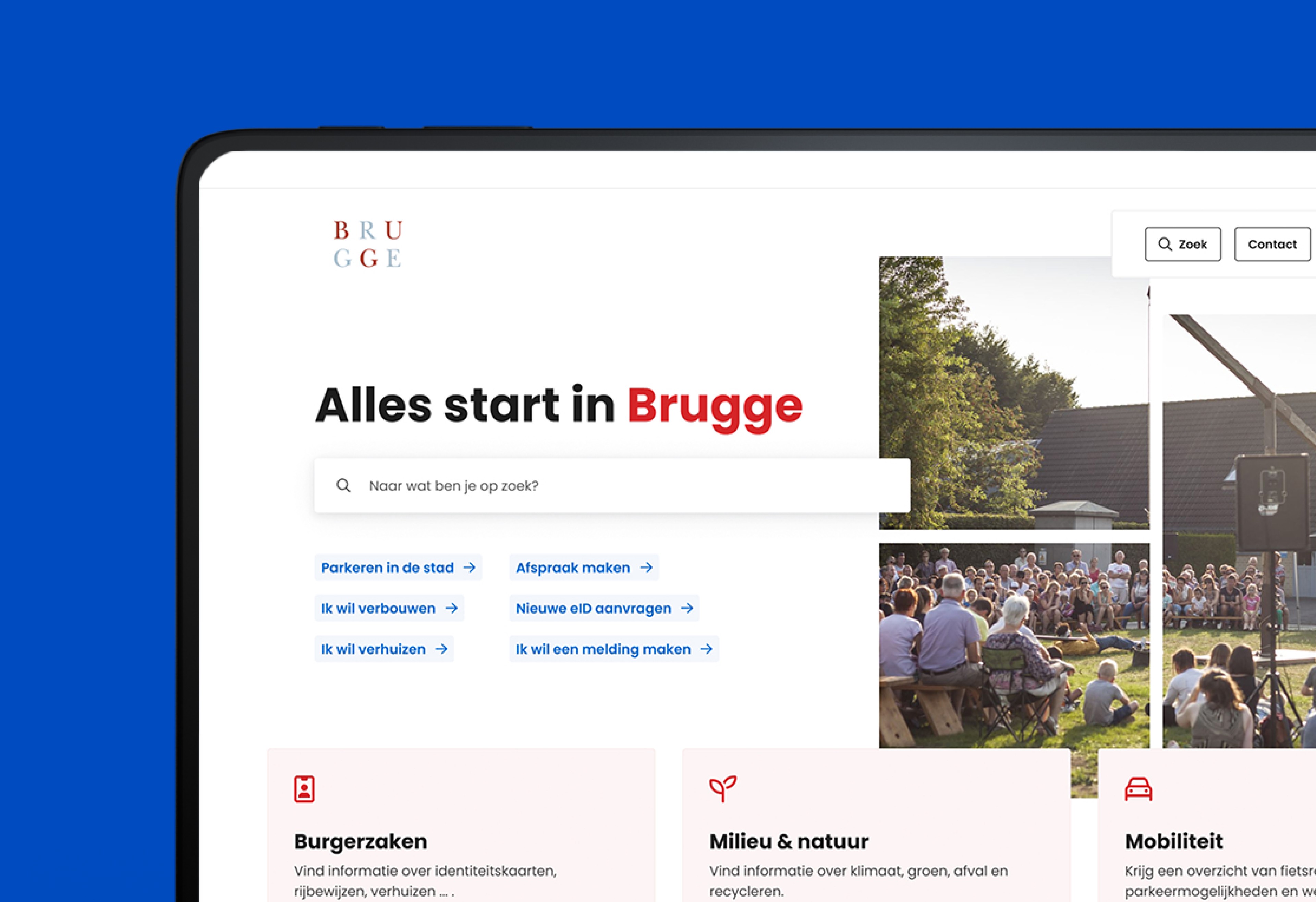
The homepage became a decision layer. It guides users based on what they're trying to do, not which department owns the content. We also introduced a redesigned appointment flow, stronger search, interactive maps, integration with Mijn Burgerprofiel and a modular design system within Drupal CMS.
The platform is live, scalable and built for departments to manage their own content without breaking the experience. Most importantly: citizens can now find what they need. Fast.
Alongside the information architecture, we built the full visual foundation from scratch. Light branding, but deliberately so, the design system had to serve a public institution, not overpower it.
That meant building it properly:
A component library covering every UI pattern across the site
A typography and colour system that scaled across hundreds of pages
Page templates for every content type, consistent across departments
Design tokens in Figma connected to the dev handoff
Departments could manage their own content without touching the design. The system held.