ROLE
UX/UI DESIGNER
YEAR
2025
DESIGNTEAM
5 DESIGNERS
TIMELINE
1YEAR +
Reynaers Configurator

about
Context
Reynaers makes aluminium window and door systems. Their configurator is used by architects, fabricators, sales teams and homeowners. Same tool. Completely different needs. The assignment: reshape the whole experience. Not just visually, but structurally. Homeowners exploring at home. Fabricators deep in technical specs. Sales persons on large showroom screens. Tablets in the field.
One tool. Multiple contexts. Extreme product complexity. And we are still building it.
My role
Part of a 5-person design team. I owned the configuration flow, the interaction model and the device strategy. Rethinking how thousands of product combinations become something a human can actually navigate. Prototyping 3D interactions. Designing for four screen contexts. Testing, iterating, repeating. Less about screens. More about a system that could scale.


challenge
A single window profile has hundreds of parameters. Multiply that across every system, variant, finish and accessory, you're in the thousands.
The risks were obvious:
Overwhelming the user immediately
Burying important technical constraints
Building something only experts could use
Breaking the experience across devices
And it's not just an inspiration tool. It feeds directly into production and technical workflows. The data has to be right.
Simple to say, hard to solve: balancing precision with clarity.

how did i get there
result.
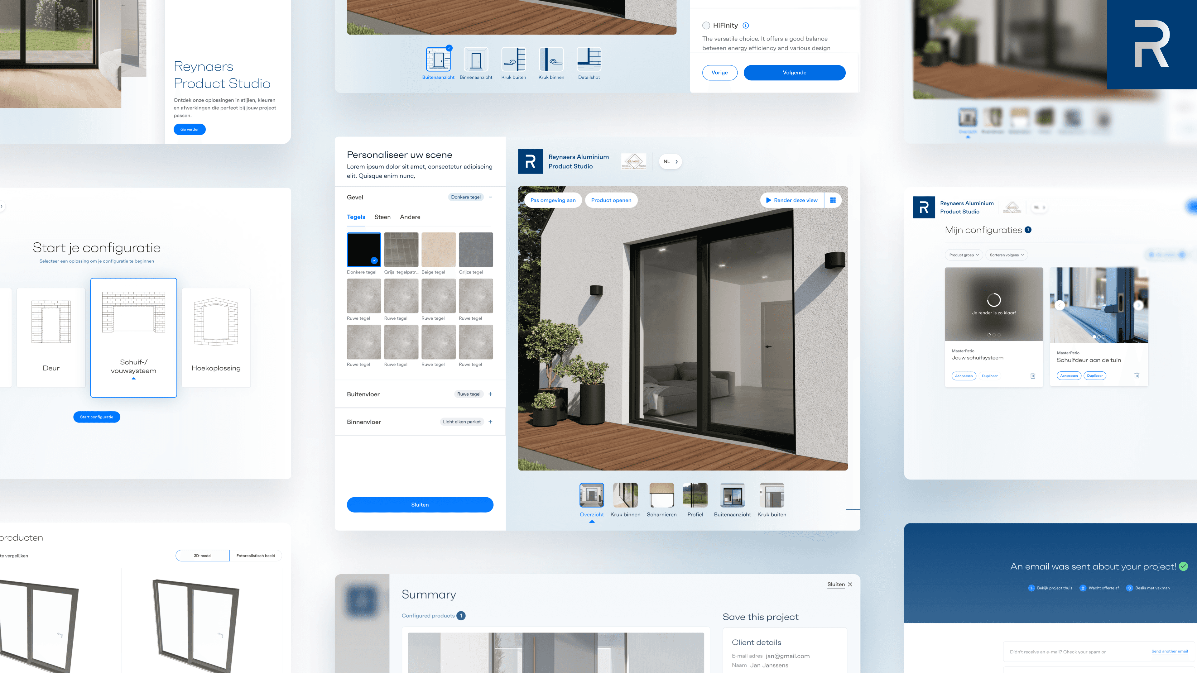
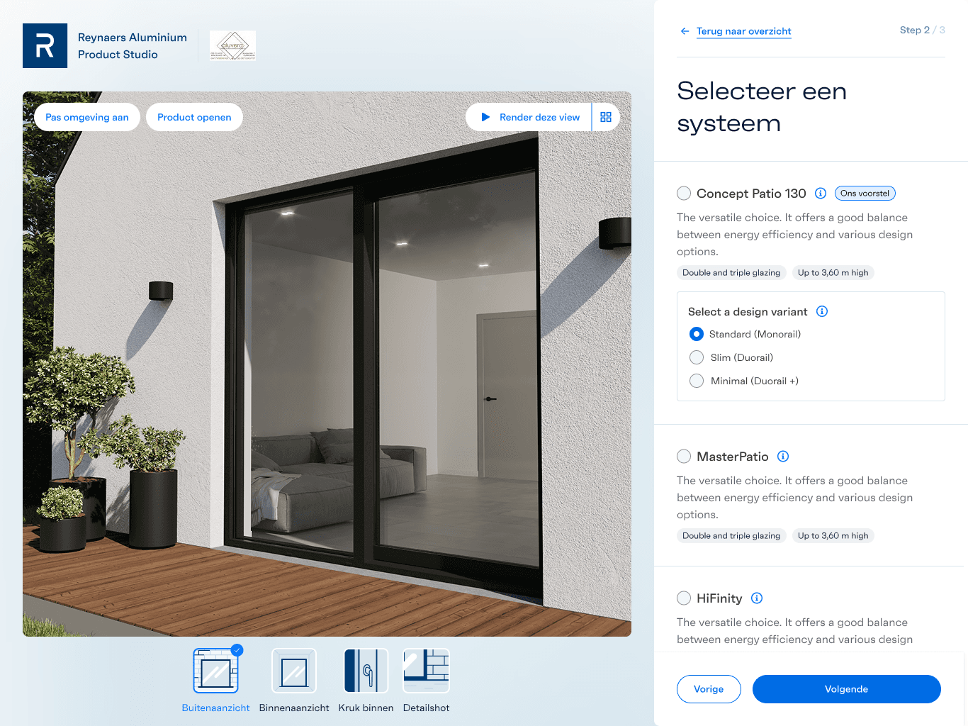
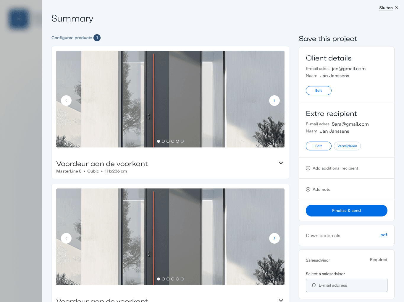
Progressive disclosure was my answer. Instead of showing everything at once, we structured the experience into 11 steps. Each decision narrows the next.
System selection separated from variant configuration
Visual-first exploration using 3D renders
Technical info shown when needed, not constantly
Modular components across desktop, tablet and large touch screens
A summary layer that turns configurations into plain language
One thing that surprised people: a product compare feature. Users can put two systems or variants side by side, visually, without needing a spec sheet. That decision alone cut a lot of back-and-forth.
The flow runs end to end, from screensaver to confirmation email. The summary doesn't just recap the configuration, it generates a downloadable PDF and triggers a confirmation. The design connects all the way through to production.
Under the surface: complex product data. On the surface: manageable.
Everything designed and documented in Figma, from early concept flows to final handoff specs. Development and UX worked in parallel the whole way through.