ROLE
LEAD UX AND STRATEGY DESIGNER
YEAR
2024
DESIGNTEAM
JUST ME
TIMELINE
5 MONTHS
Public Health Research App
about.
Context
Sciensano, the Belgian public health research institute, came to us with a clear request: "We need an app." Their goal was to map food deserts, food swamps and food oases across Flanders. Over 70,000 food providers. Eight weeks of data collection. Real citizens doing the work. The challenge was not technical. It was behavioural.
My role
Lead UX and strategy designer. Just me on design, working alongside a project manager and a development team. I helped shape the project from "we need an app" to "what should this actually be?" and then took it all the way through to interface.
Facilitating workshops and focus groups
Conducting interviews to shape the concept
Translating research goals into a clear product strategy
Defining the app structure and interaction model
Designing the UI and contributing to the brand direction
I was mainly responsible for concept, user experience and interface design.


challenge
Traditional research asks people to be data sources. Long surveys. Clinical language. Eight weeks of patience for no obvious reward.
Sciensano needed consistent participation, reliable data and a broad audience across Flanders. If the app felt like a government questionnaire, people would drop out by week two.
We had to design something that felt meaningful and light, while still collecting scientifically solid data.

how did i get there
result.
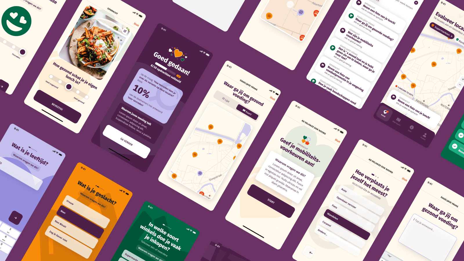
We reframed the app from a research tool into a shared mission.
Participants weren't filling in surveys. They were contributing to a map of their food environment, together.
Gamified participation — daily questions, location evaluations and food challenges structured as small, manageable actions. Progress tracking made eight weeks feel finite and achievable.
Dual-purpose interactions — every action served both the user and the research. Evaluating a supermarket's variety through a simple slider gave researchers nuanced data while asking almost nothing of the user.
Friendly, accessible branding — warm colours, playful illustrations, conversational language. The opposite of a government form.
Clear onboarding and transparency — participants could see what they contributed and why it mattered. That built trust and kept people in.
The app launched. The research ran. The result is a research platform that turns passive subjects into active collaborators. That's it. That's the whole brief.