ROLE
UX/UI DESIGN
YEAR
2025
TIMELINE
1 MONTH
DESIGNTEAM
JUST ME
Artist Data Web App
about.
Context
Greenhouse Talent is an international concert promoter and booking agency. For them, data isn't decoration. It drives booking decisions.
Together with Sensr, a scraping platform pulling data from multiple sources, we designed an internal analytics platform. One place where bookers and promoters can evaluate any artist quickly and confidently.
This was a product used daily by professionals making high-stakes decisions. Every booking is a financial bet. The data had to be right and fast.
My role
Solo UX and UI design on the platform.
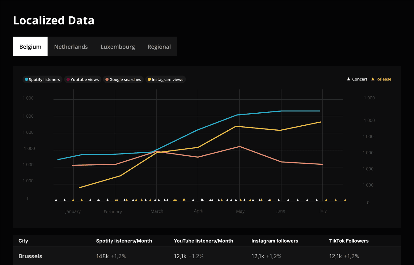
Structuring complex statistics into understandable dashboards
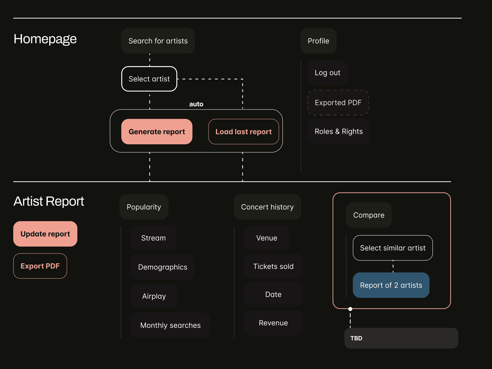
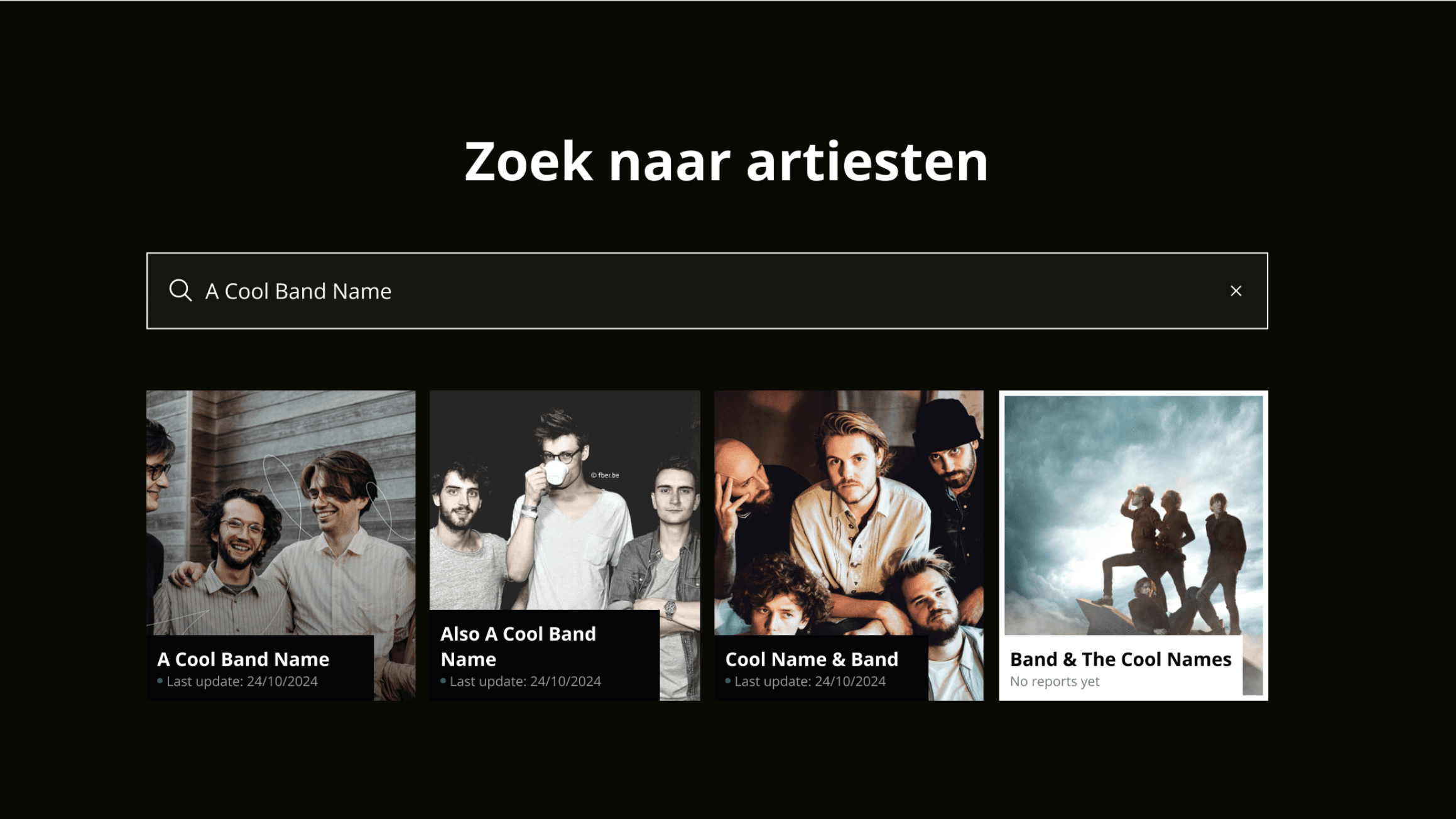
Rethinking the search to report to export flow
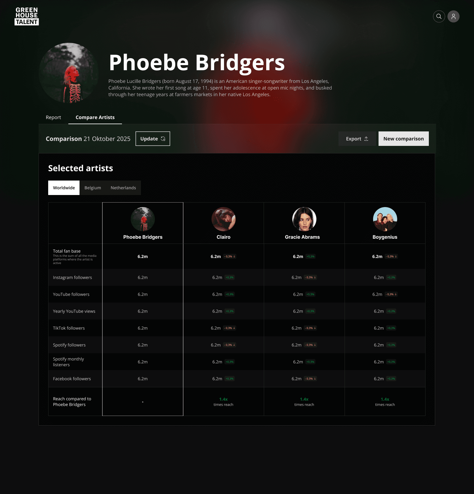
Designing artist comparison tools
Improving performance perception during heavy data loads
Building a dark, brand-aligned interface
challenge
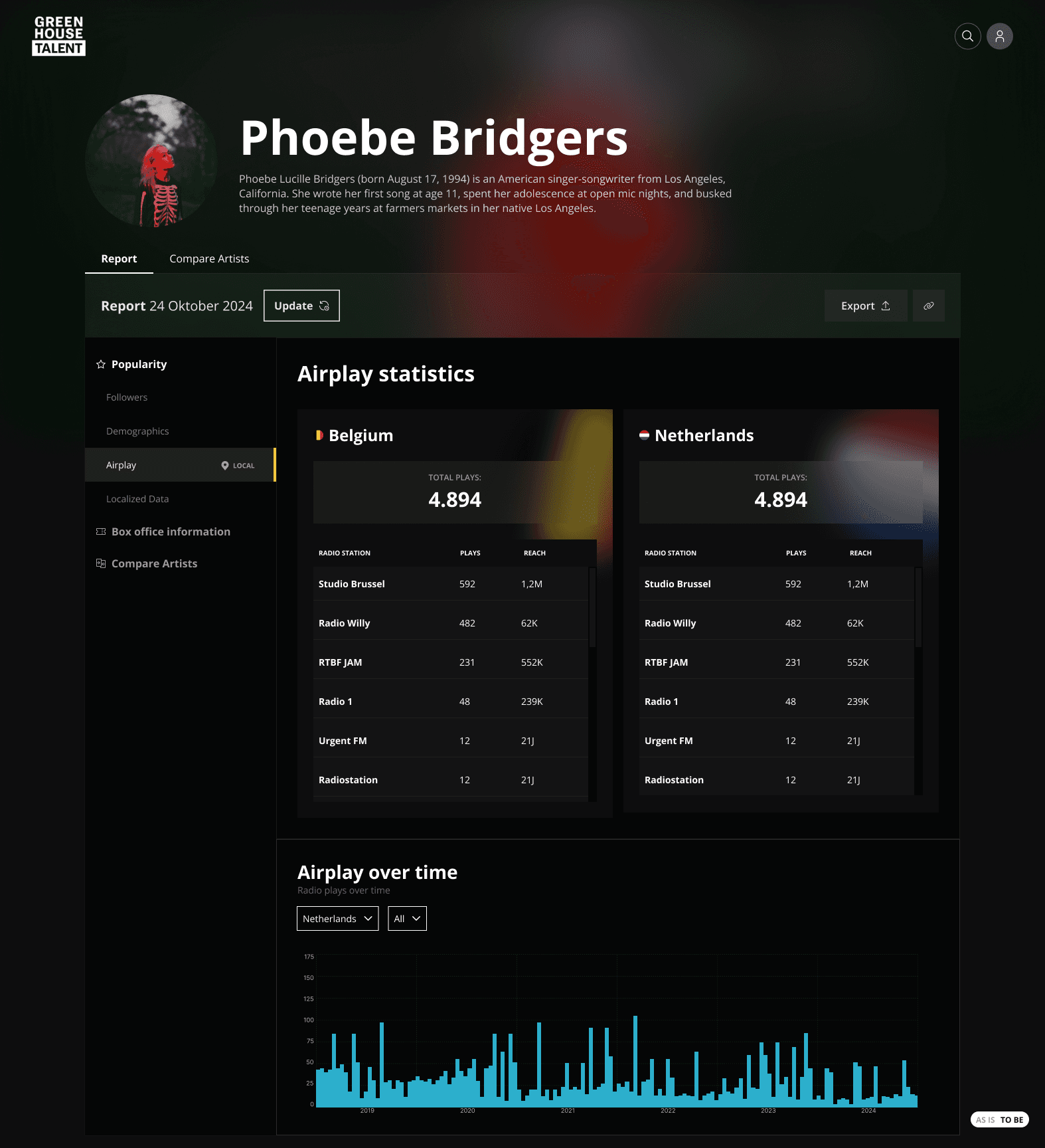
Bookers needed answers to very practical questions. Is this artist popular in Belgium? Which cities? What does their airplay look like? Are they growing or fading? Is this venue the right size?
The data existed. All of it. But it wasn't structured around decision-making. Reports took time, felt heavy, and required too many steps before a booker could actually act on anything.
The main tensions:
Huge amounts of data from multiple sources
Report generation that felt slow even when it wasn't
Non-digital stakeholders who needed to give useful feedback
Balancing actual performance with perceived performance
This was not about showing more charts. It was about showing the right ones.

how did i get there
result
Centralised search — searching for an artist became the single entry point. From there, everything else flows. Reports load without friction.
Structured dashboards — statistics grouped around real questions: popularity, demographics, airplay, monthly searches, concert history. Progressive disclosure and hover interactions reduce cognitive load without hiding depth.
Comparison tools — promoters can put two artists side by side and immediately see who fits a specific venue or market.
PDF export — reports export as visually consistent PDFs built with Puppeteer. Full design control, reusable components, performance managed without sacrificing quality.
Dark, brand-aligned interface — dark mode to match the music industry context and create focus. Professional without feeling corporate.
The result is a tool where a booker can go from question to decision in under a minute. The data didn't change. The way it was presented did.