ROLE
UX/UI DESIGNER
YEAR
2023-2023
DESIGNTEAM
3 DESIGNERS
TIMELINE
6 MONTHS
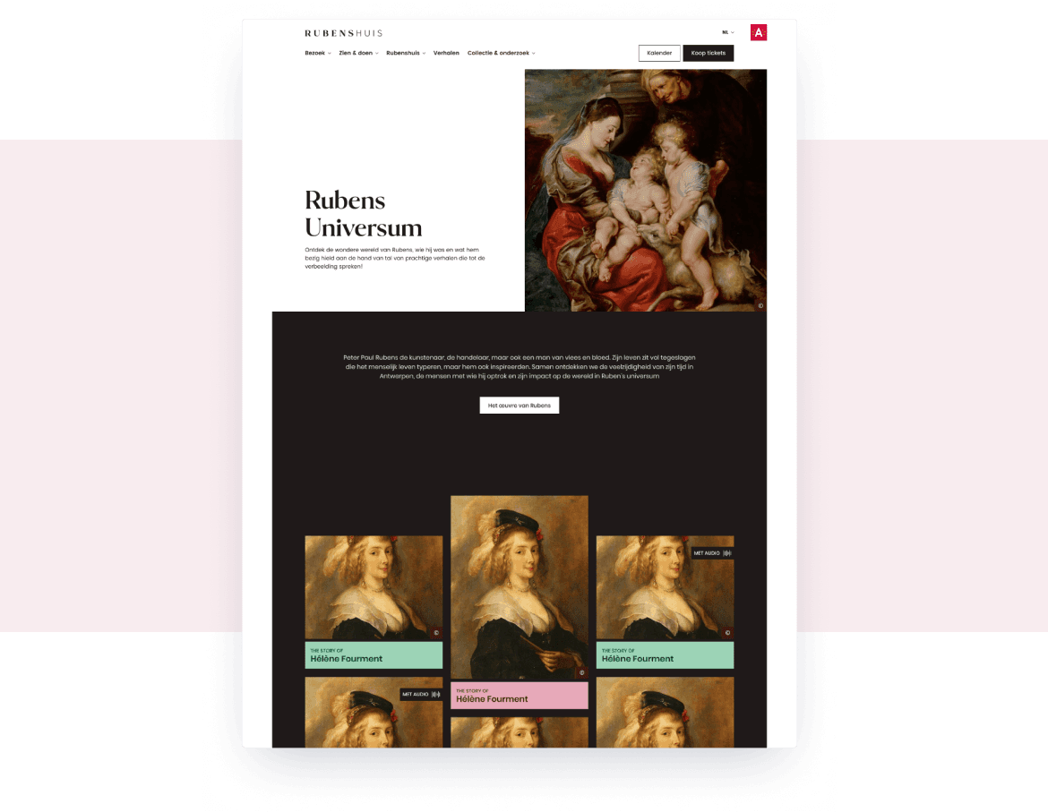
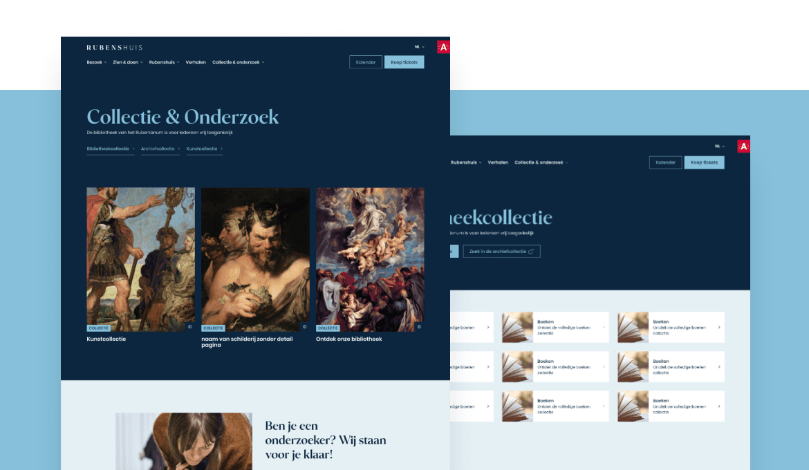
Rubens' Museum

about.
Context
Rubenshuis, the former home and studio of Peter Paul Rubens, reopened after a major renovation. They needed a new website to go with it.
It had to sell tickets. But it also had to serve researchers, art historians and visitors who just want to understand the man behind the paintings. And two existing websites needed to merge into one coherent platform.
Respect the heritage. Build something contemporary. Make it actually work
My role
One of two lead designers on the project.
I facilitated information architecture workshops and conducted user interviews to understand what each audience actually needed. From there I helped shape the structure, the visitor journey toward ticket purchase, the research section and the translation of their new brand into a functional interface.
Strategy first, execution after. Get the structure right before touching the visuals.
challenge
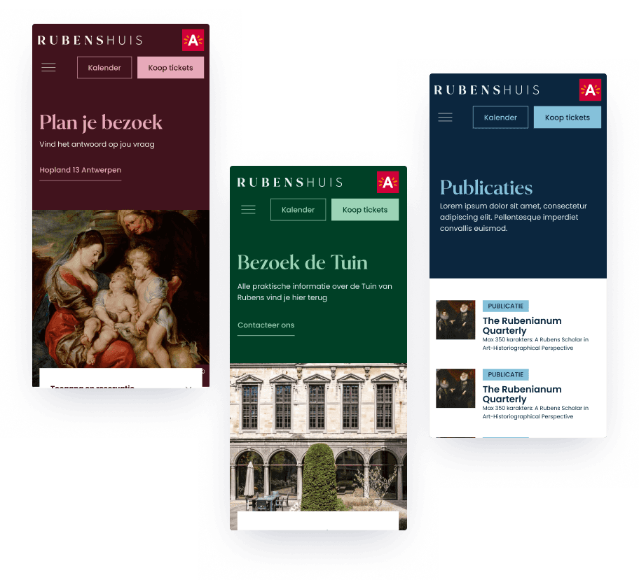
Rubenshuis serves three completely different audiences:
Visitors who want tickets and practical information
Art lovers exploring exhibitions and stories
Researchers needing deep access to historical material
Same website. Completely different expectations.
On top of that, the museum had just launched a new brand identity: contemporary, distinctive, a little bold. The website had to carry that personality without getting in the way of usability.
The core tension:
How do you design something that feels refined and cultural, yet stays simple and commercially effective?
how did i get there
result.
We rebuilt the information architecture around clear entry points for each audience type.
A ticket flow that stays accessible no matter where you are on the site
A research section that integrates without overwhelming the visitor experience
A modular design system built directly from the new brand language
High-performance architecture using a static site setup with headless Drupal
IIIF integration for deep-dive access to high-resolution artworks
The result is a platform that handles ticket sales, research depth and brand positioning without any of them getting in each other's way.
Visitors can buy a ticket in three clicks. Researchers can spend an hour in the archive. Both feel like the site was built for them.